
Introduction
OneBrand embarked on an exciting journey with First Stop Health (FSH) to revamp their website and seamlessly transition to HubSpot, a groundbreaking healthcare company on a mission to transform the lives of millions across the United States. With just a simple push of a button, they’re making affordable health-related services accessible like never before!
FSH is at the forefront of reshaping how healthcare services are accessed, providing groundbreaking solutions that empower individuals to proactively manage their well-being. Placing a strong emphasis on both affordability and accessibility, FSH harnesses state-of-the-art technology to ensure that health-related services are conveniently accessible with a simple tap from anywhere, anytime.
Challenge
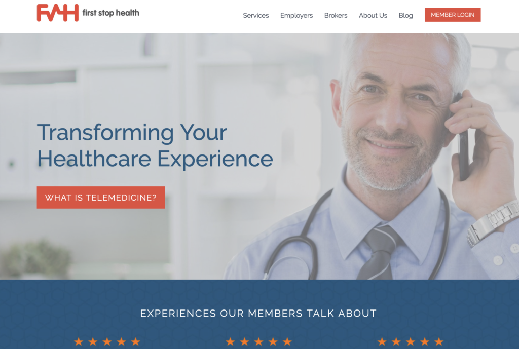
FSH found itself in a highly competitive market without the essential tools needed to truly distinguish itself. Their existing website was outdated, far from offering a well-defined user experience, and it suffered from an inconsistency in its visual language. Moreover, the website failed to effectively communicate the core of FSH’s unique selling proposition, making it challenging for them to convey what truly set them apart in the healthcare industry.
In a landscape where innovation and differentiation are paramount, FSH recognized the urgent need for a comprehensive overhaul to not only keep up with their competitors but also to make a memorable and lasting impact on their target audience.
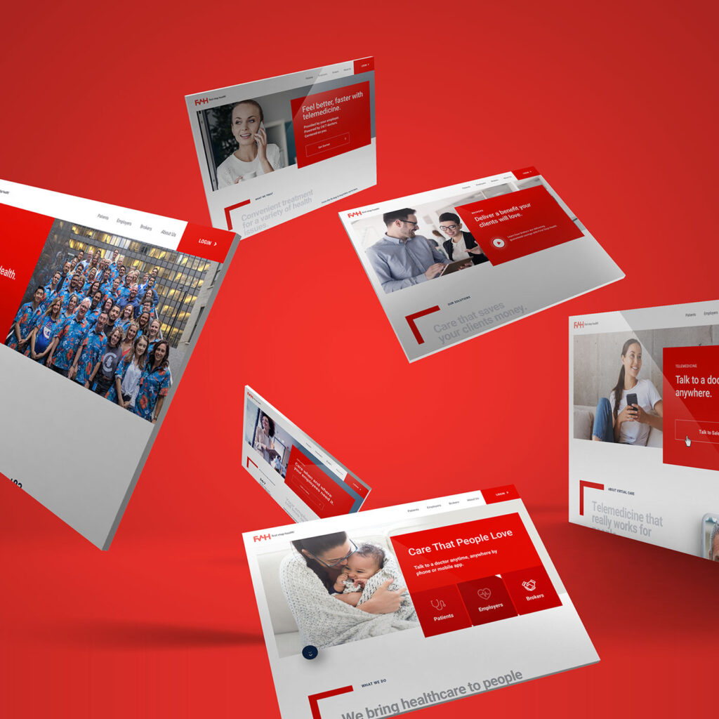
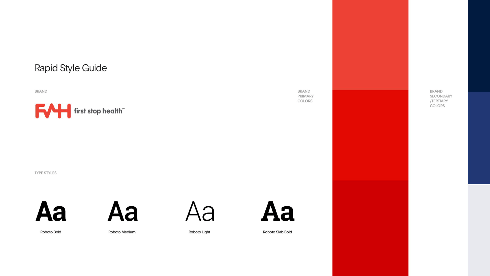
OneBrand redesigned FSH’s website to have a crisp, clean, and modern look to appeal to tech-friendly patients interested in a more efficient healthcare experience. We chose a striking aesthetic with dominant red and white text and appealing visuals to catch readers’ attention and interest. Then, we automated a marketing system to aid FSH in identifying and engaging with new leads and prospect opportunities — from top-of-funnel to paying customers.
Our goal was to accelerate their online growth by improving their relevance, branding, and organic reach potential. So, we put our creative team to work to generate engaging content for their marketing campaigns. These segments featured captivating patient stories and relatable, on-brand content that spoke directly to their ideal customer personas. The response and the results were phenomenal.
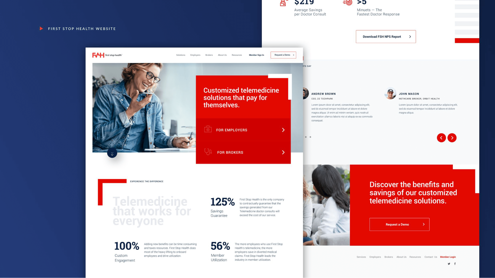
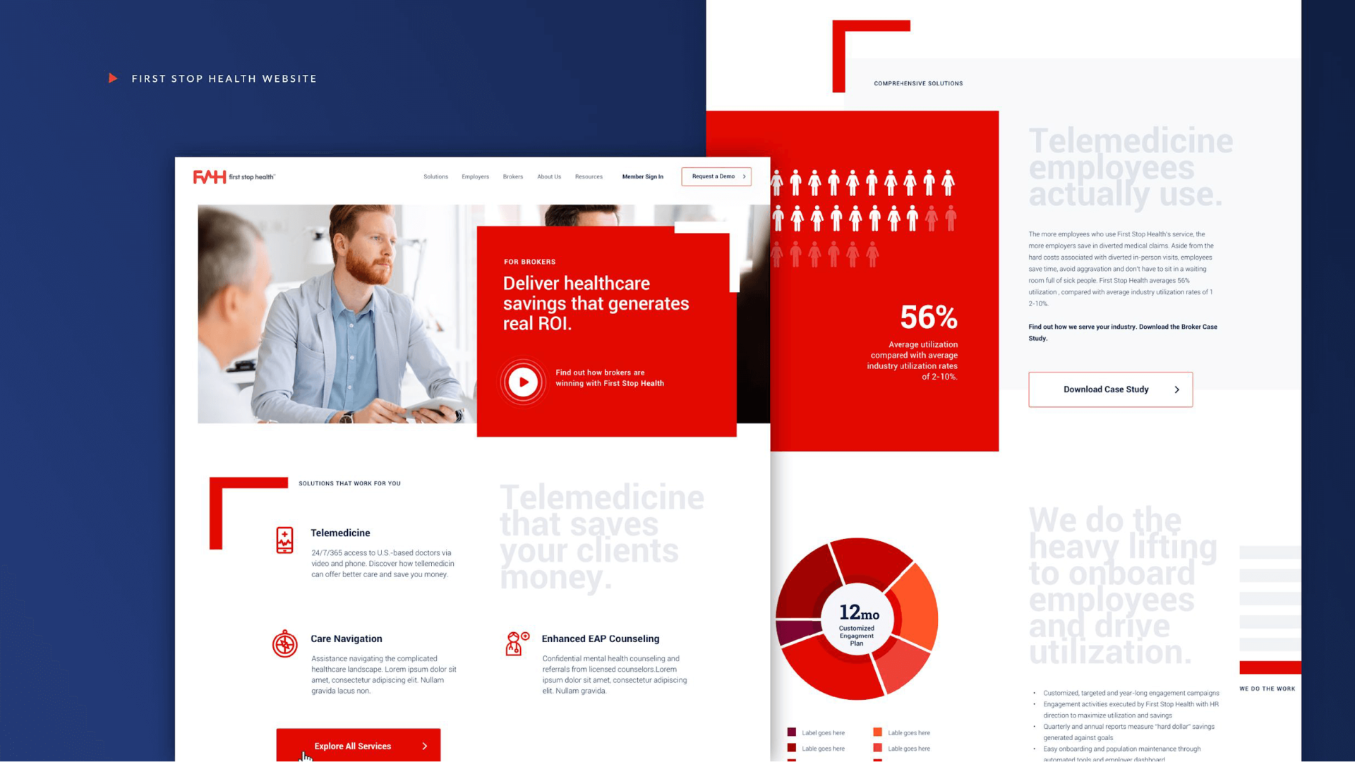
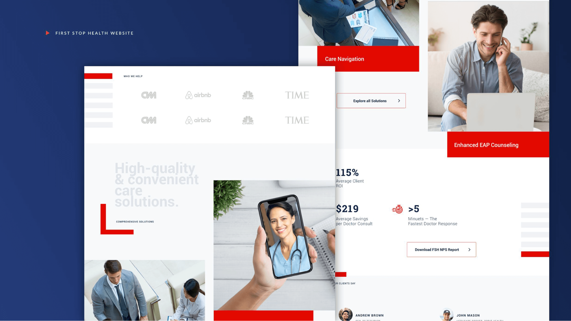
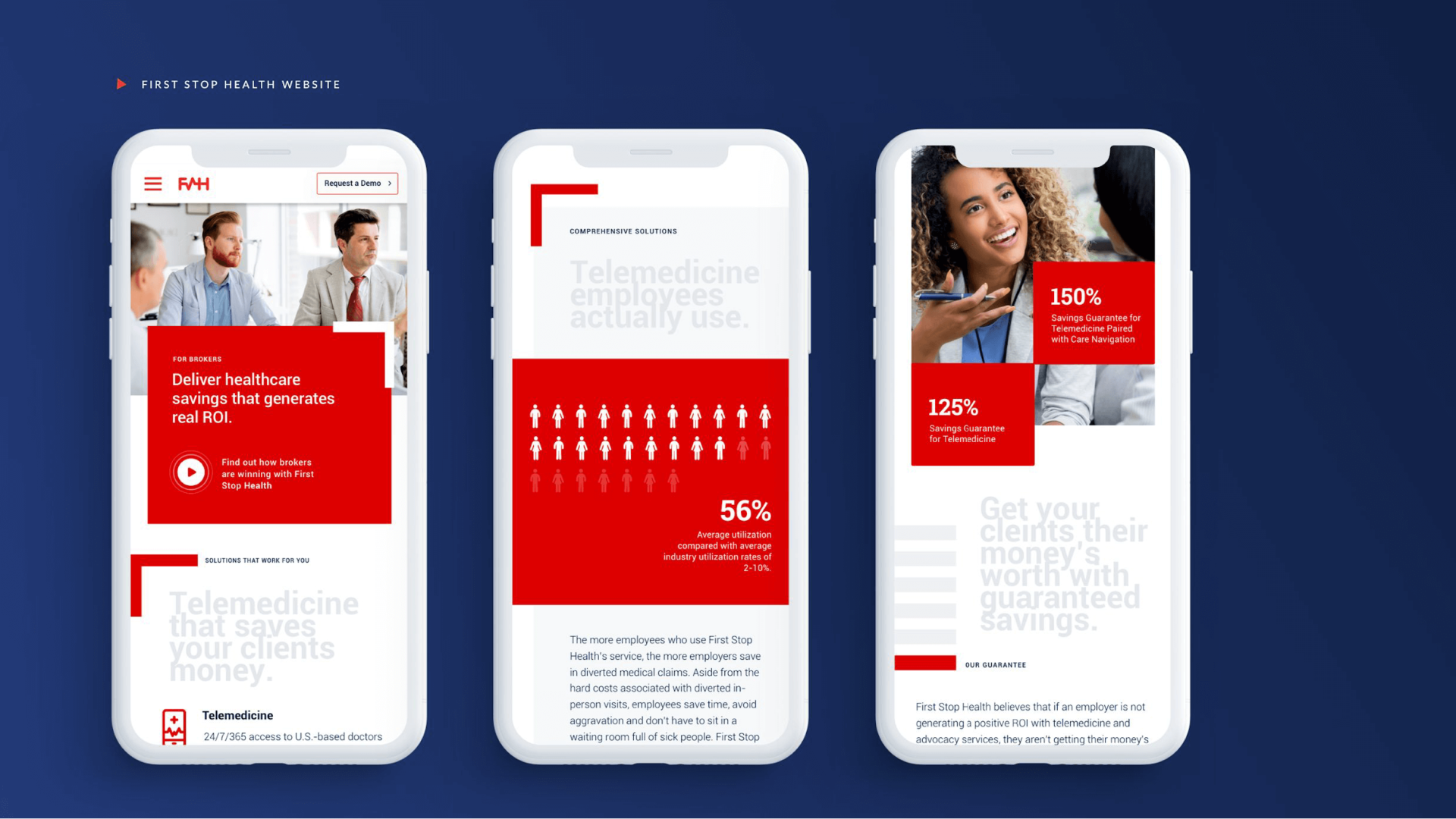
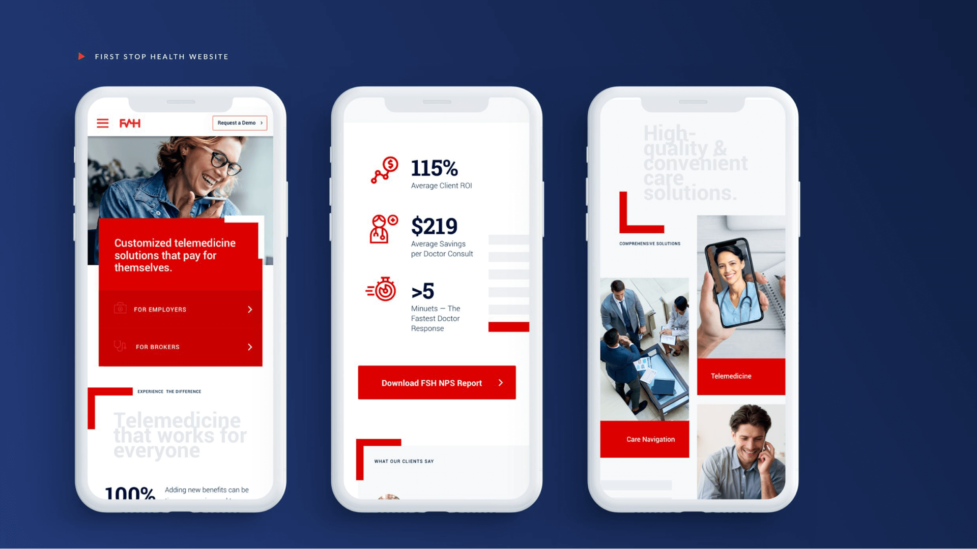
FSH’s new website provides the user with a unique endtoend experience that feels streamlined, clean, and simple to navigate. Patients are supplied with relatable, educational content specifically designed to address their individual health needs throughout the customer journey. Our extreme attention to detail ensures that all patients on FSH’s site are offered the correct information where they want it and when they need it.
Their brand is far more approachable and recognizable, allowing external channels like social media and email to feel cohesive. Patients feel like they have access to care at any point because FSH’s web portals are updated and contain all the information they need. With a unified and branded experience, FSH’s patients always know who they’re interacting with whenever they engage with the website and company as a whole.
